You are here
Visualization tools for digital dataset derivation graphs
If you were a scientist working with more than 10,000 new data points every week, how well would you be able to keep track of all the changes you made to the data to obtain the final results? Moreover, if you were to look at your research 5 to 10 years from now, how well would you or any other scientist be able to reproduce your results from the original data? This summer, I am working with Emery Boose, researcher at Harvard Forest, Barbara Lerner, professor of Computer Science at Mt. Holyoke College and Yujia Zhou, rising senior at Dikinson College, to develop effective tools for creating, keeping and accessing a record of all the processes the data undergoes throughout a research project.
The history of data from its collection to its output as a final result is known as provenance data and it is essential for the reproducibility and validation of results. Although it is possible and quite common to manually capture provenance data through narrative description, this practice is not adequate for large datasets which undergo complex processes. In this case, we need powerful software tools for automatically capturing and storing provenance data in a digital format.
To get a better understating of some of the issues scientists have to face on a daily basis when it comes to recording provenance data, we took a closer look at two of the research projects going on here at Harvard Forest.
First Stop: The ecology of forest watersheds on the Prospect Hill Tract
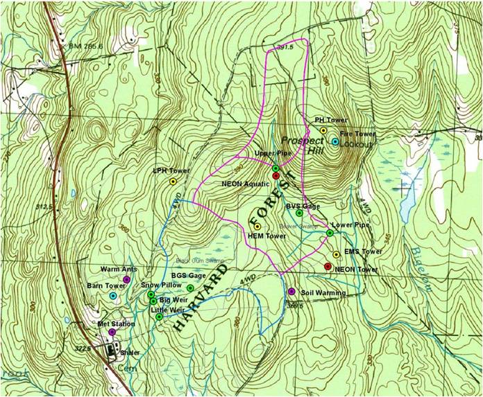
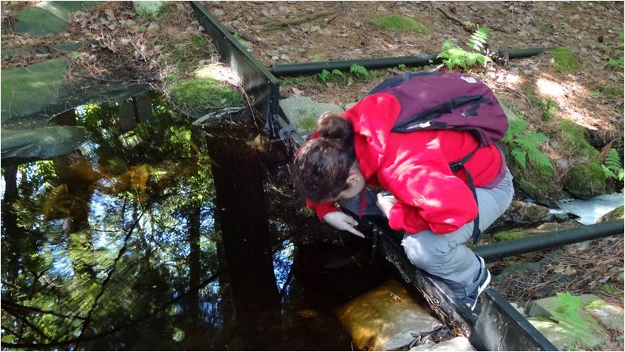
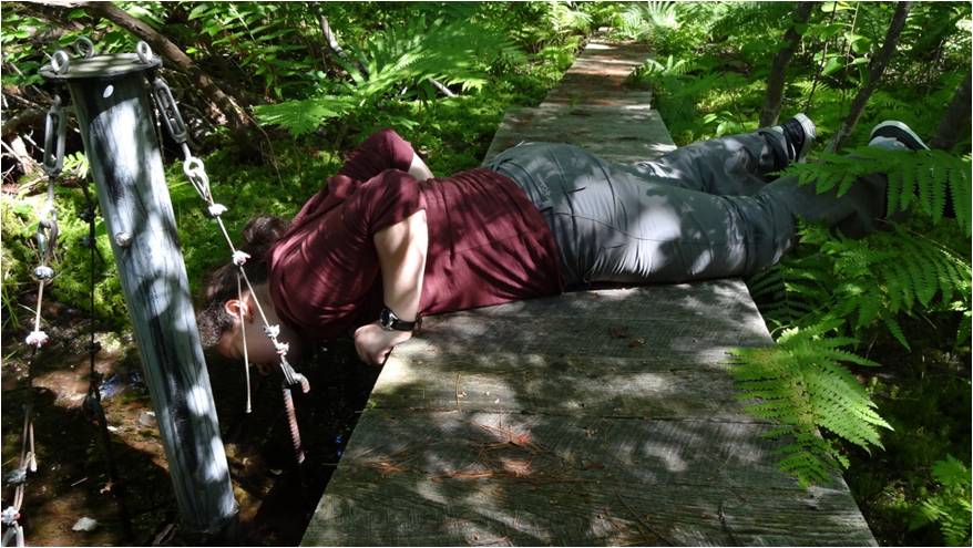
Forest watersheds play a crucial role in forest ecosystems. Any change in the quantity of water available to an ecosystem has an immediate consequence on its dynamics. For 10 weeks, we ventured into the woods and gathered about 100,000 points worth of data from six stream and wetland gauges on the Prospect Hill Tract.
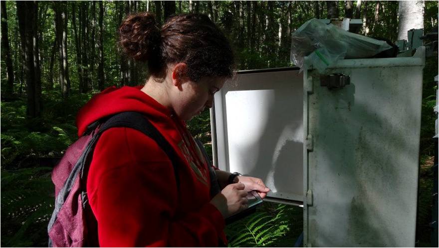
We found that every week scientists have to check for equipment malfunction and sensor drift, mark or model corrupted data and keep track of all these processes … for each and every one of 10,000 data points!
Next stop: Climate change with data from the Fisher Meteorological Station
Climate change has become a serious concern for scientists around the world. However, despite all the interest shown in this matter, many questions remain still unanswered. One of the ways in which scientists study climate dynamics at Harvard Forest is by tracking atmospheric changes using data from the Fisher Meteorological Station. This means that another 10,000 data points need to be processed every week using a similar approach with the one we used for the hydrological data. 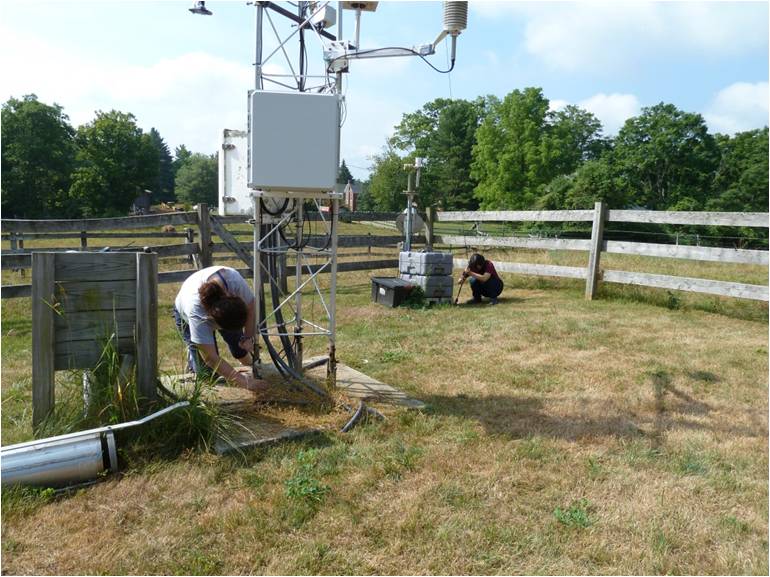
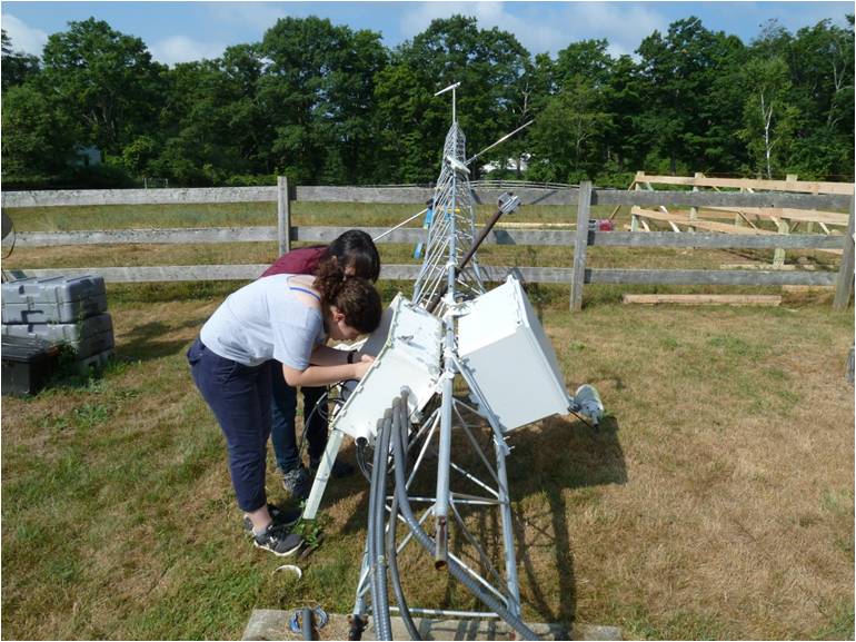
This summer we also had to change the sensors for the meteorological station and send the old ones back for recalibration which means that data collection was perturbed on that day. All this needs to be properly documented for future reference.
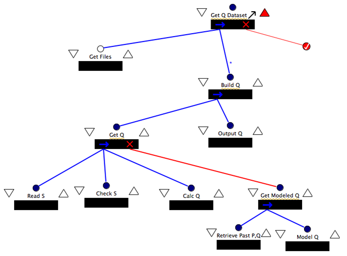
To respond to these issues, we used Little-JIL, a graphical programming language for defining processes developed at the University of Massachusetts, Amherst, to capture and store provenance data digitally. Little-JIL allows users to define and execute a process through a Process Definition Graph (PDG), a graphical representation of all the possible ways a point in a dataset can be processed. This is an example of a PDG used to compute the stream discharge from the hydrological data collected:
Little-JIL also produces a dataset derivation Graph (DDG), an abstract mathematical object which shows how every point in a dataset was processed. However, the DDG comes in the form of numbers and names which describe how the different pieces of the processes are connected for every data point processed. This can be very difficult to interpret even for small datasets. Therefore, to make provenance data easier to understand, we developed a way to display in the form of interactive visualizations and we included several features to make DDGs of large datasets manageable. To do this, we extended Prefuse, a graphical platform written in Java which supports visualizations of data structures such as graphs and trees.
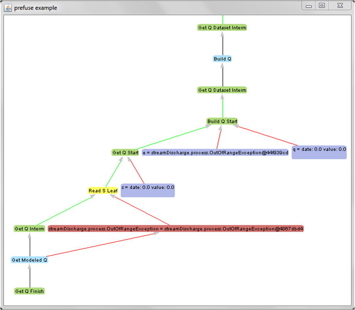
One of the most important features of this program is that it collapses or expands parts of the graph, allowing the user to focus on certain parts of the process and manage large DDGs. The light blue labels in the graph above represent a step in the PDG shown before. Once the processes contained in that step are finished, the program automatically collapses the step, thus reducing the size of the visualization and enhancing its clarity.
Future research will focus on building queries to retrieve only the relevant information from the database storing the provenance data and will seek to display the results of these queries visually through the implementation of the software tools we developed this summer.

