You are here
MODIS satellite imagery as applied to phenological assessment, team BU
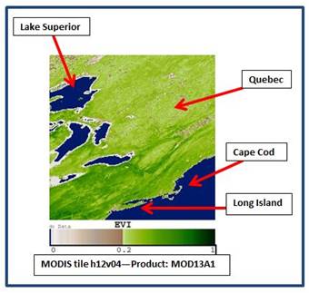
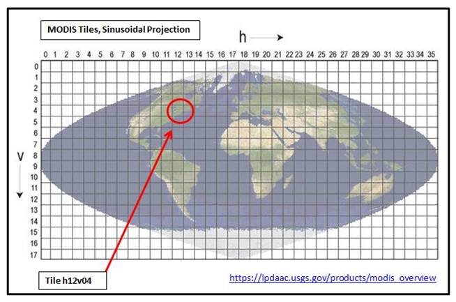
Observations of vegetation phenology can be collected not only from ground-level field studies but also space borne remote sensing instruments. In particular, satellite images may be used to assess vegetative phenophase transition dates such as spring onset, maximum vegetation cover and senescence across regional scales. One approach to such assessment entails analysis of data from the MODIS (Moderate Resolution Imaging Spectroradiometer) instrument. MODIS provides measurements of light reflectance that can be analyzed to estimate phenophase transition dates with respect to variation in land cover type. Despite the utility of the MODIS data, atmospheric factors including cloud coverage and presence of aerosols as well as land cover features such as snow and ice, can distort data received by satellites, rendering this information unreliable. Differences between the outputs of various MODIS satellite products are also a result of factors including the timing of the satellites’ orbits, intervals between image collection and the way in which the reflectance values are processed. These anomalies result in each product yielding a varying quantity of valid data. A goal in remote sensing research is determining which MODIS product contains the greatest amount of high quality information to be used to accurately calculate phenophase transition dates. In order to assess the differences between and overall utility of these MODIS products, we have created a variety of plots and maps which address: NDVI (normalized difference vegetation index), EVI (enhanced vegetation index), date of spring onset, land cover variation, differing levels of quality control, comparisons across time series within and between years, and quantity/location of ‘good’ data— all of which illuminate the unique strengths and weakness of the MODIS products.
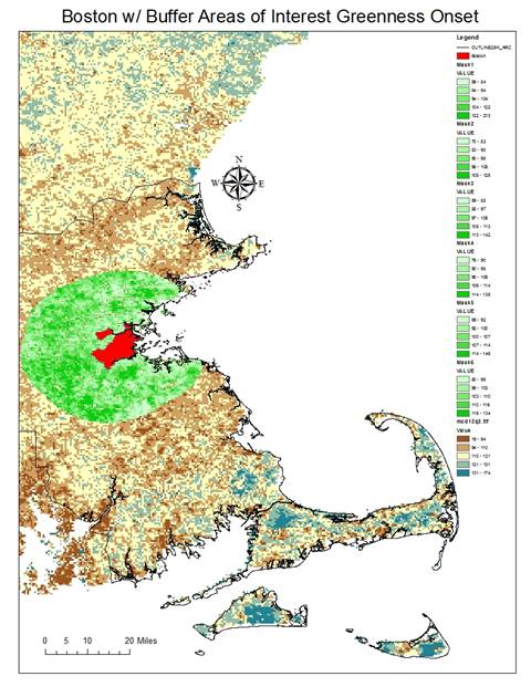
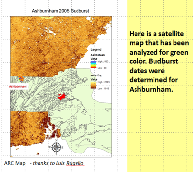
In addition, team BU has been analyzing data from satellite imagery and the resulting picture tiles. Pixel values can tell us the date of Green Onset and yearly trends for entire tiles, corridors, and even single pixels. We opened MODIS 12Q2 tiles in ArcMap, which is a great tool for working with these images. We then created six buffer zones around the city limits of the metropolitan area of Boston, Massachusetts (1-3km, 2-2km, 3-3km, 4-2km, 5-5km, 6-5km). Then, MatLab was used to produce graphs for 10 years (2001 - 2010) and then compared and analyzed to see what trends were present. We found that standard deviation declines as you leave the city and enter more rural and stable forests and this is apparent in all the buffer zones. The reasoning behind this is that the forest is more stable and deviates less. In contrast, as you get closer to Boston, the deviation is higher due to temperature increase. Due to the urban heat island effect, Boston greens up sooner and loses its leaves later than vegetation in rural areas. By looking at Boston, we can relate what could happen with a temperature increase of a few degrees Fahrenheit at a small scale to a global scale. Ultimately, we can use this data to better understand global warming and inform the population.

